14. December 2021
European Conflicts
Application Phase
I’m currently in several application phases for a new job. Among others is the federal foreign office in germany. Recently I was taking a written test for the position of a data scientist. They told me, the test will revolve around the ACLED data set. Careful as I am, I wanted to prepare well. I didn’t know about the tasks in the test, so I was examining the data set and prepared some analyses for what i thought is best.
Acled Data
The Armed Conflict Location & Event Data Project, short ACLED, collects data among others about protest, political violence or events of conflict around the globe. They are freely accessible here, after registration.
I was first looking at fatalities and its outliers. The reported fatalities at a conflict event are quiet vague, which is also recognized by ACLED. These numbers are collected, based on news reports. So it is always dependent on how accurate they report. Concequently we can see accumulations in where was rounded on full 10.
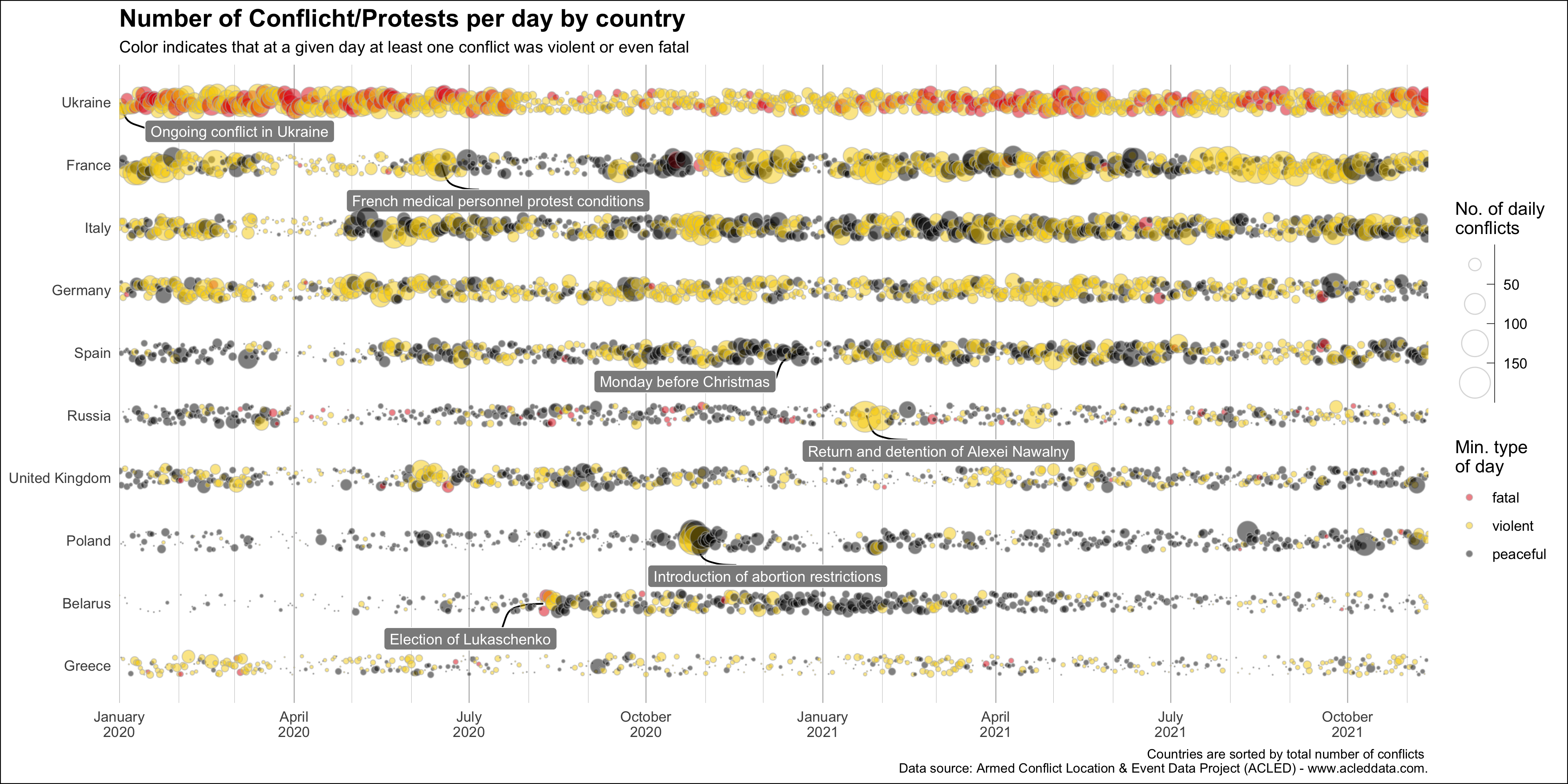
I guess the data provides enough material to do a 30 day map challange by itself, because every event is tagged with geo location. But I wanted to focus on protest data in europe. The data is complete from the year 2020 onwards, why I focus on the timeframe 2020-2021. I look closer on the top 10 countries by total number of protest over the last two years, because I want a fast overview. Although I assume there might be more countries with very interesting data points.
Each day will be categorized by type, peaceful, violent or fatal. Here, I check if one protest on a given day fulfills this requirement. It needs to be disclaimed, that the picuture will be distorted, because you can’t know for a given day, if there was one protest with a single fatality or whether there were many protests with a lot of fatalities. I have to think about a way to clear that picture. Maybe using a gradient color scheme based on the number of incidents.
So finally, I count the protests per day and country and can take a look at the plot. My code can be seen here.
|
|
I like this Plot, because you can spot some some striking conflict days. I tried to label the most interesting. Unusually active protest/conflict days as well as quieter christmas days or the beginning of the covid-19 pandemic become visible. Sadly, also the ongoing Ukriane conflict with many fatal days and a lot of incidients throughout the whole two years.
There are many more days I want to look into, but the space in the visualisation is limited. This would make a good starting point for a interactive space and means, I have to extract the most descriptive words from each days news report. That might be tricky.
The biggest flaw of this visualisation is the incorrect impression you can get by the type of day. As mentioned above, one violent or fatal event per day causes the whole day to be violent or fatal. My ideas, right now to mitigate this effect is to show a point per type and day, so you can easily see how many events happened for each type. Another way could be to implement a gradient, so days with many violent events are more in a yellow area, than days with mostly peaceful events and one violent, which would still be black. I will leave the image here and might update this post when I found a better solution.
Find the full resolution image here
