25. July 2019
Climate in Alert
Today, I want to talk about a little bit about climate data and its visualization. Two articles lead to the idea for this blogpost. Lisa Crost wrote a post about how the visualization of the economist might be misleading. Data-Vis and the economist was already an interesting topic back in march, when they very openly talked about their mistakes creating graphs. I think Lisa Crost very well addressed the importance of context and how always referring to the mean or other summarised values can cause a wrong picture.
Briefly after seeing Lisa’s post, I was reading about highest ever temperatures in the northernmost Canadian weather station. Temperatures reached never before seen 21 ºC. Following the economist scheme above, a graph could have looked like this.
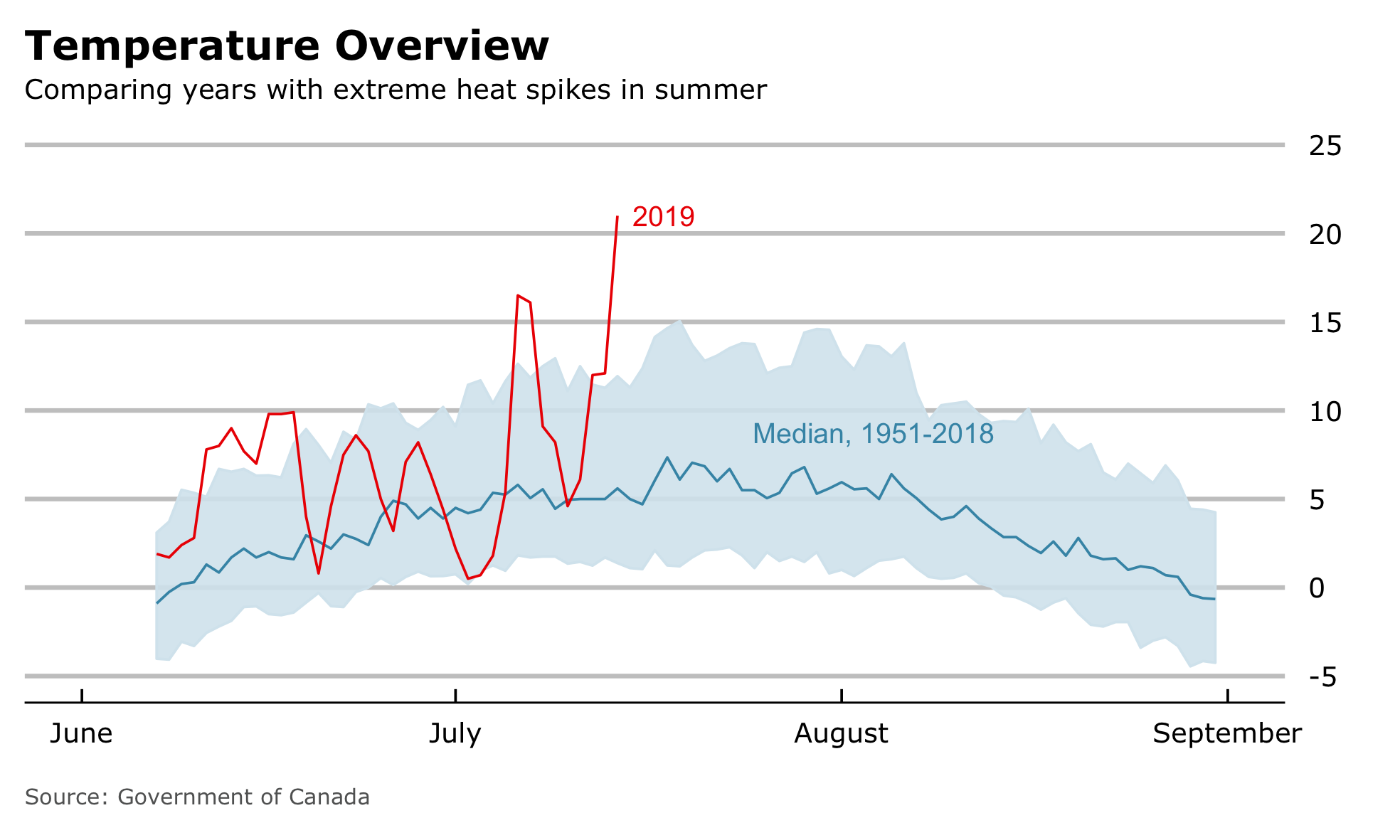
We can see the median value across the years 1951-2018, considering an interval of 80% of all values around the median and compare that to the current year 2019. Although the “Wow”-Moment isn’t that intense, it clearly points in the same direction of misleading information, which definitely needs more context. Together with the article about 21 ºC in Alert I received a message how the media is exaggerating. All of this motivated me, to deep dive into climate data of Alert and produce some context.
The Data
The government of Canada provides very detailed information from their climate stations. Climate data from Alert go back until 1951. As I wanted to take a look at the data straight away, I didn’t automatically scraped it from the page but manually downloaded them. In my final dataset I want to consider all data from 1951-2018 and especially consider the current year 2019.
I ended up, having 67 individual .csv files. I’m not sure, what is the standard way of reading multiple files with at least commands as possible, but this is the way I thought of.
|
|
I heard of the package easycsv and its function fread_folder(), which should do the same trick, maybe I should check the performance later on. I decided for fread() not because of performance, but it allowed me to select columns based on their column number, which isn’t possible with read_csv() as far as I know.
Now I have the data and need to think about how to organize them. My target is to create a plot, which shows data from all years overlaying each other and use gghighlight to highlight individual and exceptional years. I still want to have date-type data on the x-axis, in order to easily handle values on the axis names. I ran into a problem here. The date type demands a standard unambiguous format and a combination of month and day, I briefly intended to use, isn’t close to be unambiguous. So how can I plot everything together in one plot.
Initializing Pseudo Dates [Feedback welcome]
In short, my plan is to initialize pseudo dates with same years and keep the correct year as a separate variable, so I can later distinguish between each year. My pseudo date consists of the year 1999, Month and Day. This way, I can plot the same day of multiple years on top of each other. So my final code to read the data looks like the following.
|
|
|
|
I’m curious to know, what would be the standard way of creating climate diagram with multiple years. If it is not a thing, I’d like to know why.
Further Data Prep
The remaining data handling is pretty straight forward. I summarise the old data and generate the median time series. In contrast to the economist, I’m not interested in comparing a value to 80% of all previous values. My target is to examine only the extreme heat peaks for of an arbitrary summer day. Therefore I will consider Temp_max and its 99th-quantile as an upper limit to see unusual warm years. I will highlight every year, which contains a daily maximum temperature above 99th quantile of all measurements across all years. Additionally, I want to reduce the threshold to the 97.5th-quantile and see, what years might add to the selection of exceptional years. NA’s will be treated with imputation by the median.
|
|
Visualization
The main topic is about visualizations and their impact, so lets plot something. My main focus is trying to plot all available information in their context, highlight years with exceptional high peaks of daily maximum temperature and facet by years.
99th-Quantile
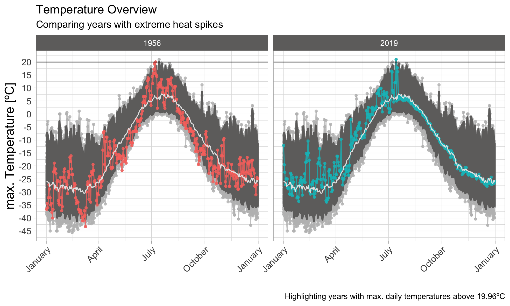
Besides the current year 2019, the year 1956 also peaked above the 99th-quantile. We can also see a very broad interval around the median, which means that a large deviation around the median value appears quite often, with occasional but regular spikes reaching above. Nevertheless, temperatures above 20ºC are very rare. Lets see how the picture changes, when reducing the upper threshold.
97.5th-Quantile
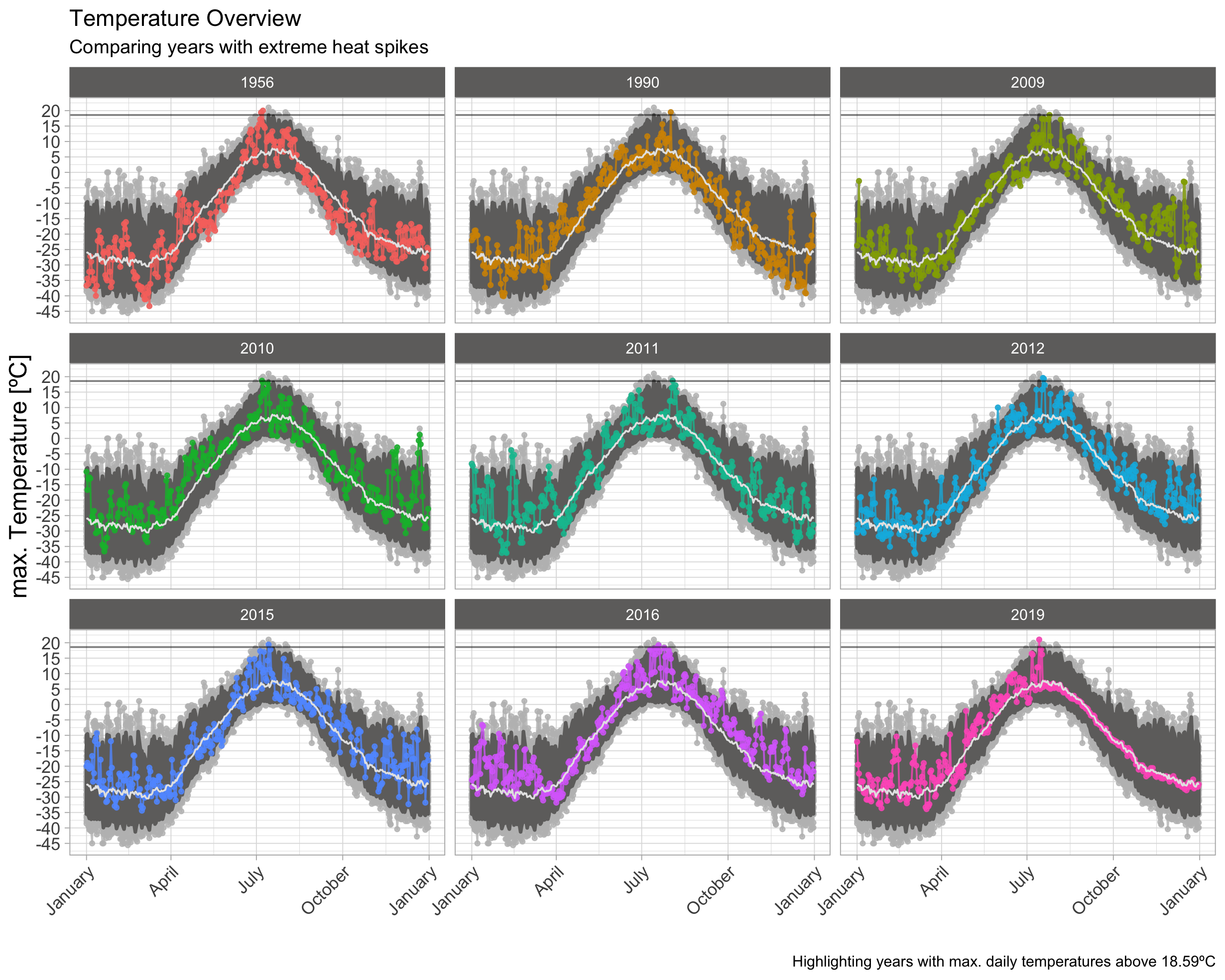
By using a lower threshold, I added 7 exceptional years to the selection of plot. This seems to be a little bit dense and surging on information in a small area. Because I’m looking on the highest overall peaks either way, I’m going to focus only on summer month. This should make the plots much more readable.
97.5th-Quantile | Summer
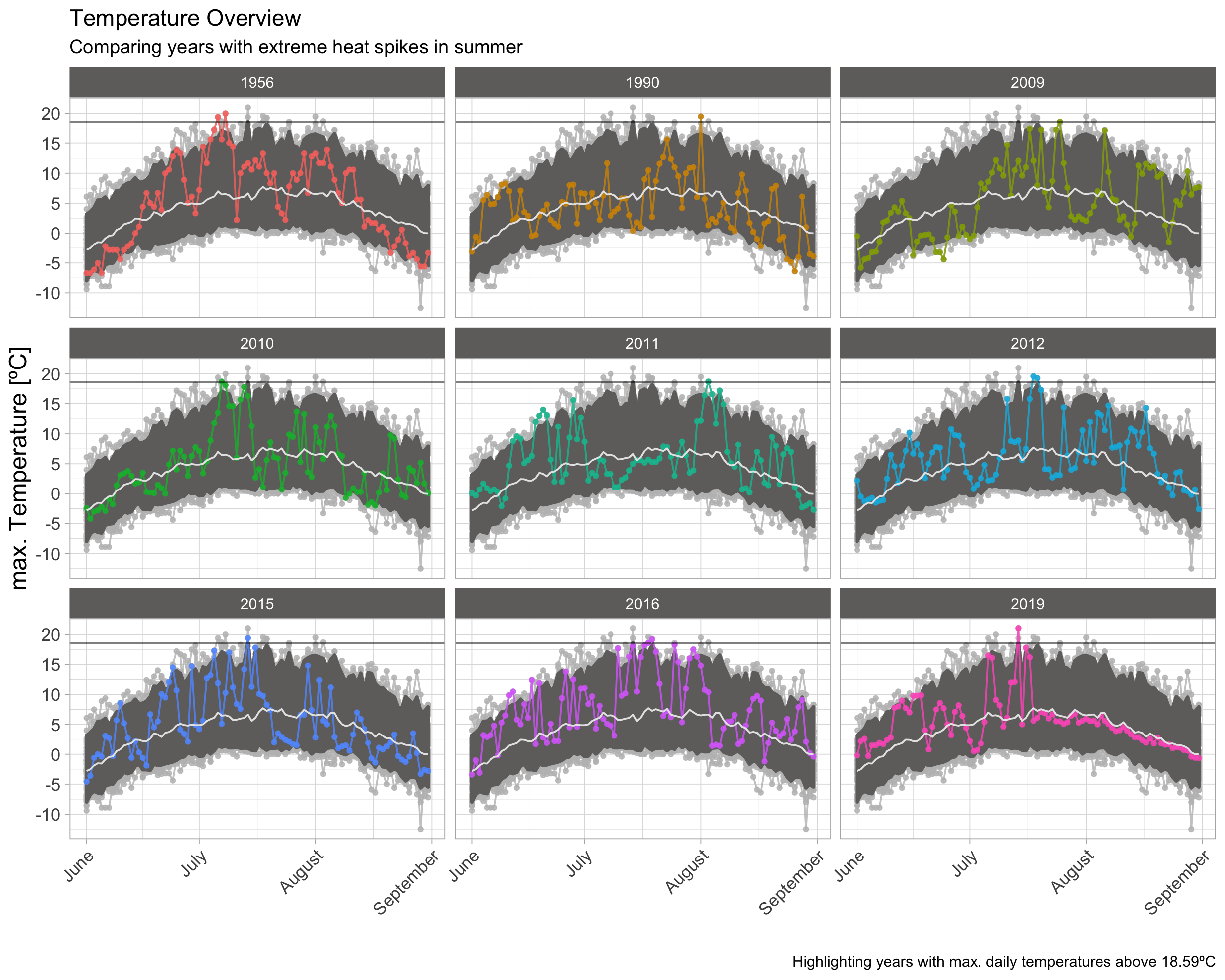
This plot helps to easily distinguish between individual peaks in a single year and compare these to other years.
Conclusion
Lets speak out some thoughts:
- 7 of the 9 highest spikes appeared in the last 10 years. As 1956 might have been a hot year and 1990 contains singular spikes, it seems quiet common today, that temperatures can reach into the range of around 19ºC.
- There is a clear difference to the topic of melting ice, in the economist story. As the glacier data shows several extraordinary years with a very high amplitude. The peaks in the Alert climate data don’t show much of an exception, but appears to follow a steady trend, with a slowly increasing amplitude. A follow up analysis might be able to show this more explicitly.
- I would therefore conclude, that this year isn’t much of an exception but the result of trend, which now happened to cross the last highest peak from 1956.
- Maybe my plot is still too overloaded with information. I like how the clean style from the economist looks like. Maybe for the case of alert climate data it would be enough to increase the confidence interval.
One Final question has to be asked, when looking at these plots. What happened in the winter of 2011? It has been a striking cold summer. I have to look into that and see if something special happened that year or if it is just an issue of data quality.
The complete Code can be found on Gitlab